The Builder
Mobile Optimization
Published @ 28/12/2025 by

Hey there, it's Nevrie! 👋
More than half of all web traffic happens on phones, so your popups need to look just as good on a small screen as they do on a desktop. The best part? PopupHero gives you independent control over your mobile design.
Let me show you how to optimize for mobile without breaking your desktop layout.
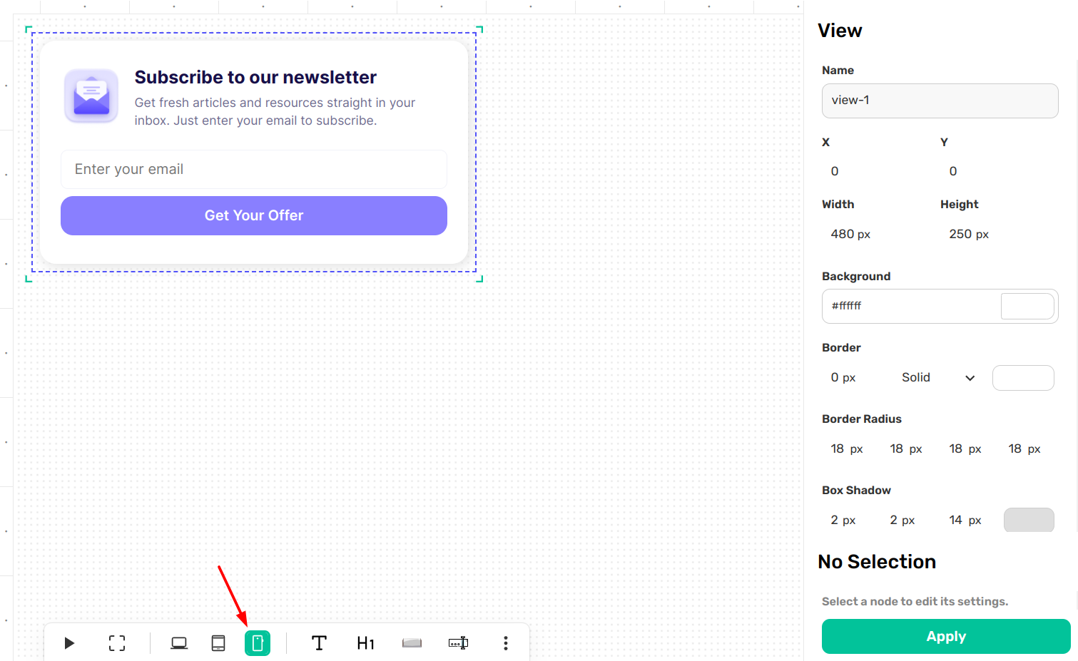
1. Switch to Mobile View
To start optimizing, look at the Bottom Toolbar. You will see device icons on the left side. Click on the Mobile icon to activate the mobile-only editor.
2. Independent Mobile Editing
Here is the magic of the Visual Canvas: when you are in Mobile View, the changes you make stay on mobile. This allows you to "re-design" for a smaller screen without messing up your desktop version.
- Resize for thumbs: Make your buttons larger or your text slightly bigger so it's easier to tap and read on a phone.
- Move and Reposition: If an image looks great next to text on desktop but feels cramped on mobile, you can move it above or below the text.
- Style for Small Screens: You can adjust padding, margins, and font sizes specifically for mobile users.
3. Activating and Applying
Just like the desktop editor, you must click on a specific element (node) to edit it.
- Click the node: Select the text, button, or image you want to change.
- Adjust in the Sidebar: Use the Right Sidebar to tweak the settings for that mobile element.
- Apply: Hit the green Apply button at the bottom of the sidebar to save your mobile-specific tweaks.
4. Toggling for Consistency
It’s a great habit to toggle back and forth between the Desktop and Mobile icons in the bottom toolbar. This lets you audit both versions of your popup to ensure the brand stays consistent while the layout stays functional for every visitor.
Pro Tip: If an element feels too crowded on mobile, you can even change its position or size to simplify the view. Remember, on mobile, less is often more!
Now that your design is perfect for every device, are you ready to set up your Display & Behavior rules?